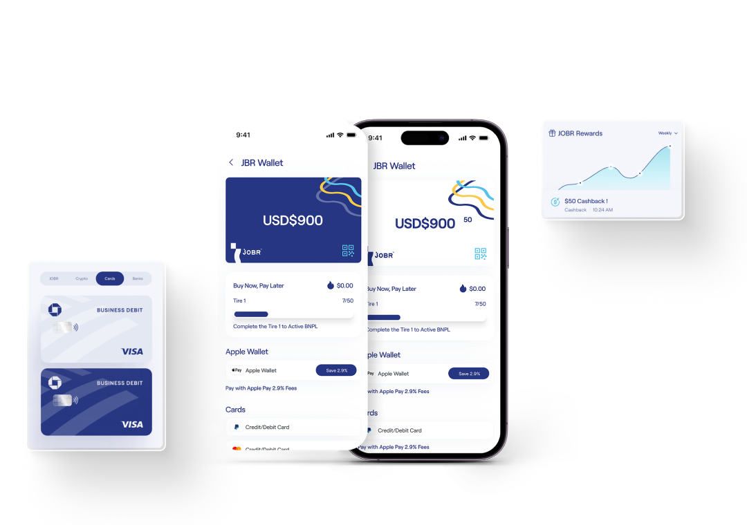
One token-based design system powering a growing multi-vertical commerce ecosystem — Market, Trade, Drive, Wallet, and Checkout — each its own sub-brand, all built on a single, disciplined foundation.
JOBR set out to build a multi-vertical commerce ecosystem — not a single SaaS product, but a family of interconnected experiences serving merchants, consumers, drivers, and traders, each carrying its own sub-brand under one parent identity.
I joined as the founding and sole designer in March 2022, when there were no screens, no components, and no system. My first decision — the one that shaped everything that followed — was to build the design foundation, an 8-step color system, a full typographic scale on Roobert, and a token library, before shipping a single product screen. That bet paid off across every vertical that followed.
Today the JOBR design system powers the core ecosystem: JOBR Market (commerce marketplace), JOBR Trade (C2C trading), JOBR Drive (fleet & delivery), JOBR Wallet (payments), and JOBR Checkout — each with a distinct mark built from the same geometric diamond motif, instantly recognisable as part of the family. Adoption sits at 68–77% (nearly double the industry average of 40%), and feature delivery is 40% faster than before the system existed. I have since grown and lead a team of three designers.
Every sub-brand mark, every color step, every type size traces back to one Figma foundation file — Foundations → Color System and Foundations → Typography — so that as the ecosystem keeps expanding, new verticals inherit years of decisions for free.

"The design system wasn't a support function. It was the product strategy — the thing that let five sub-brands feel like one company without nine times the headcount."
Market, Trade, Drive, Wallet, and Checkout were each being scoped independently, with one designer. Without shared color, type, and component rules, every new vertical risked fracturing the JOBR identity, duplicating design work, and shipping inconsistent accessibility — slowing delivery as the ecosystem grew.
An 8-step color system, a single typographic scale, and a modular diamond-motif mark language — built before any product screen — let each new sub-brand inherit years of decisions for free. Every vertical shipped faster, more consistently, and with zero post-launch accessibility regressions.

As the sole designer, I had to define an identity flexible enough to spawn distinct marks for Market, Trade, Drive, Wallet, and Checkout — while keeping every one of them legible as "JOBR" at a glance.
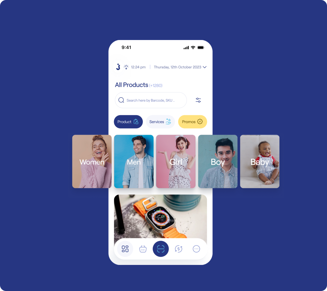
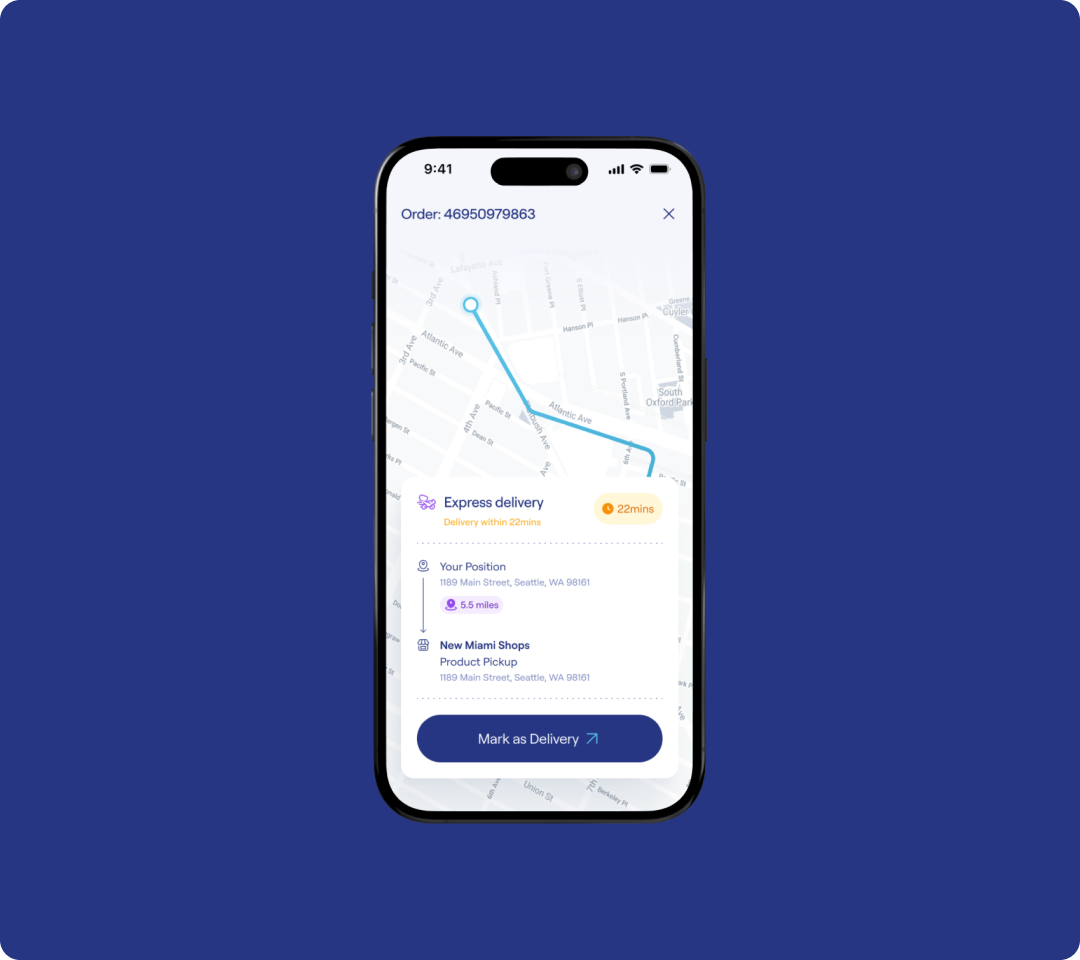
Web, iPad POS, iOS, and Android all needed to feel unmistakably JOBR while respecting platform conventions. An 8-step color ramp and a single typeface (Roobert) had to bridge that gap without fracturing.
Rather than retrofitting contrast fixes late, every single color step in the system — Primary, Complement, Neutrals, Extra, Error, Warning, Success — ships with its WCAG rating attached at the token level.
JOBR Design Foundation
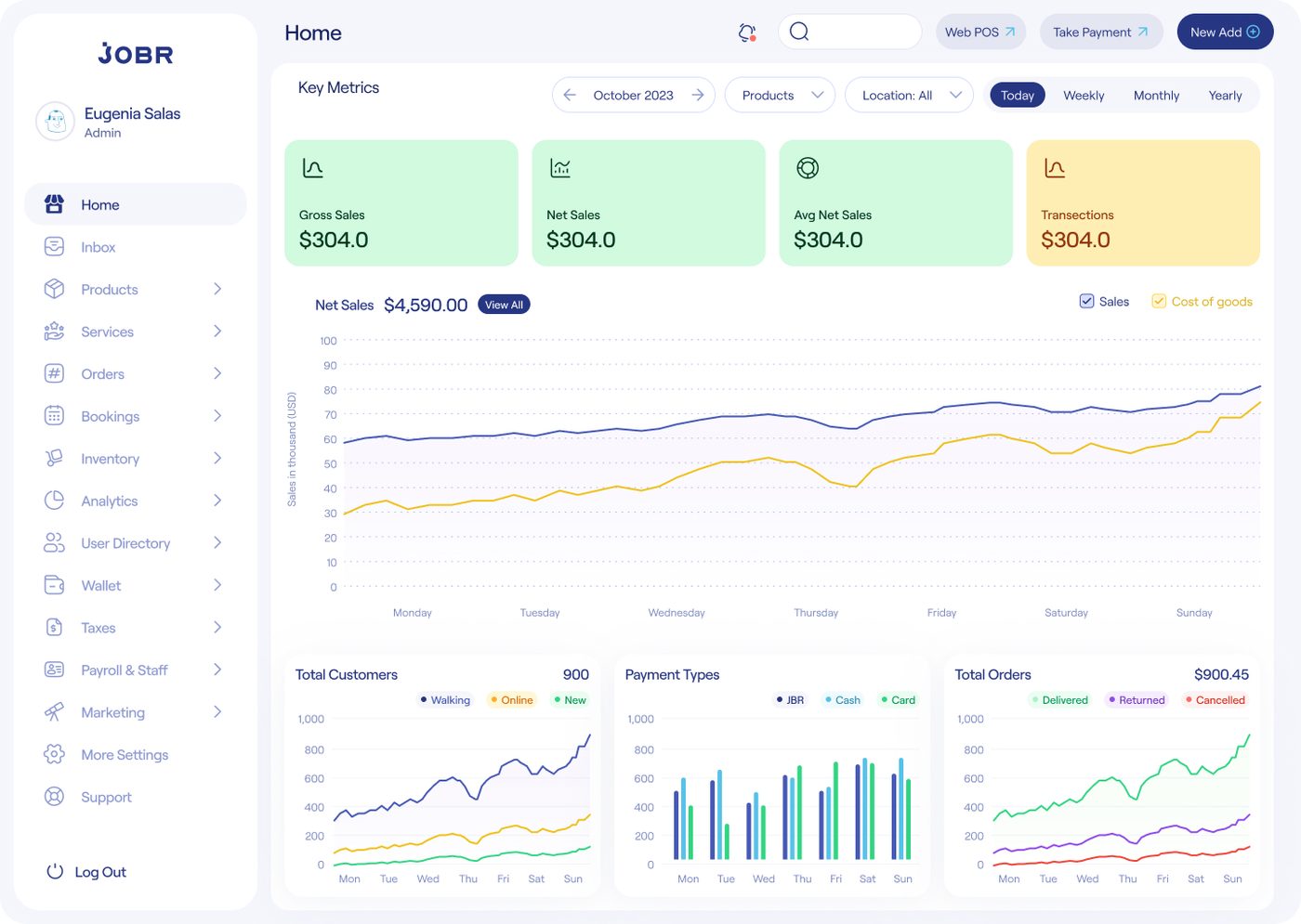
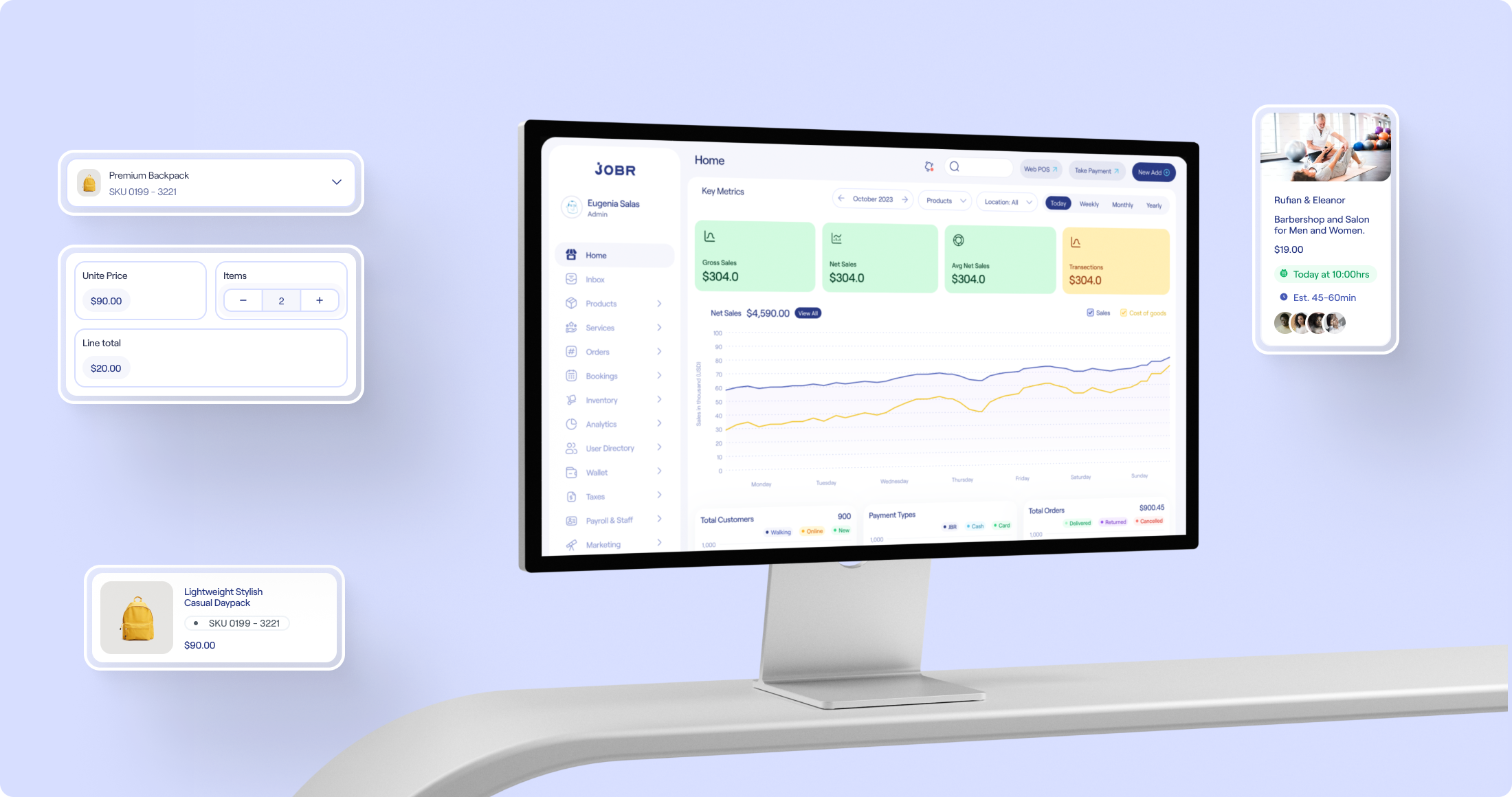
Every JOBR vertical — Market, Trade, Drive, Wallet, Checkout — reports into a single Admin Panel: one place for merchants and operators to manage products, services, orders, bookings, inventory, payroll, marketing, and analytics across the whole business, not just one app.
The most complex surface in the ecosystem. SMB owners manage their entire operation here — from a 50,000+ product catalogue to multi-channel orders, staff payroll, and real-time analytics. The challenge was depth without overwhelming non-technical users.


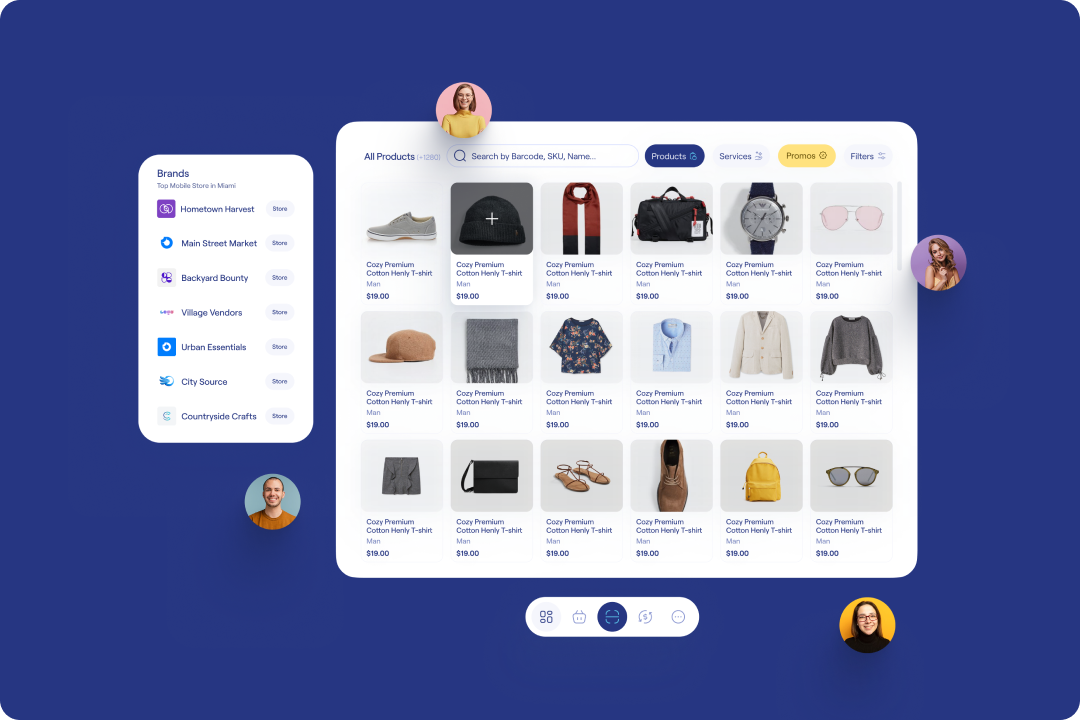
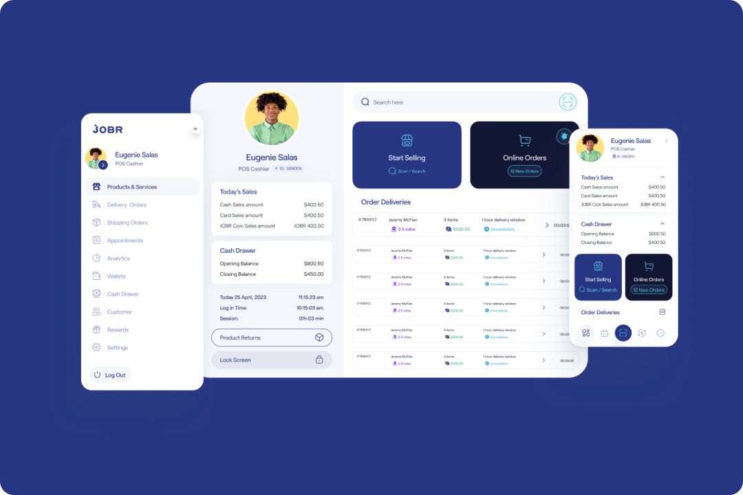
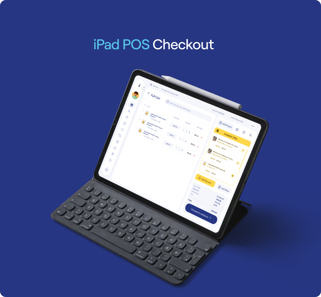
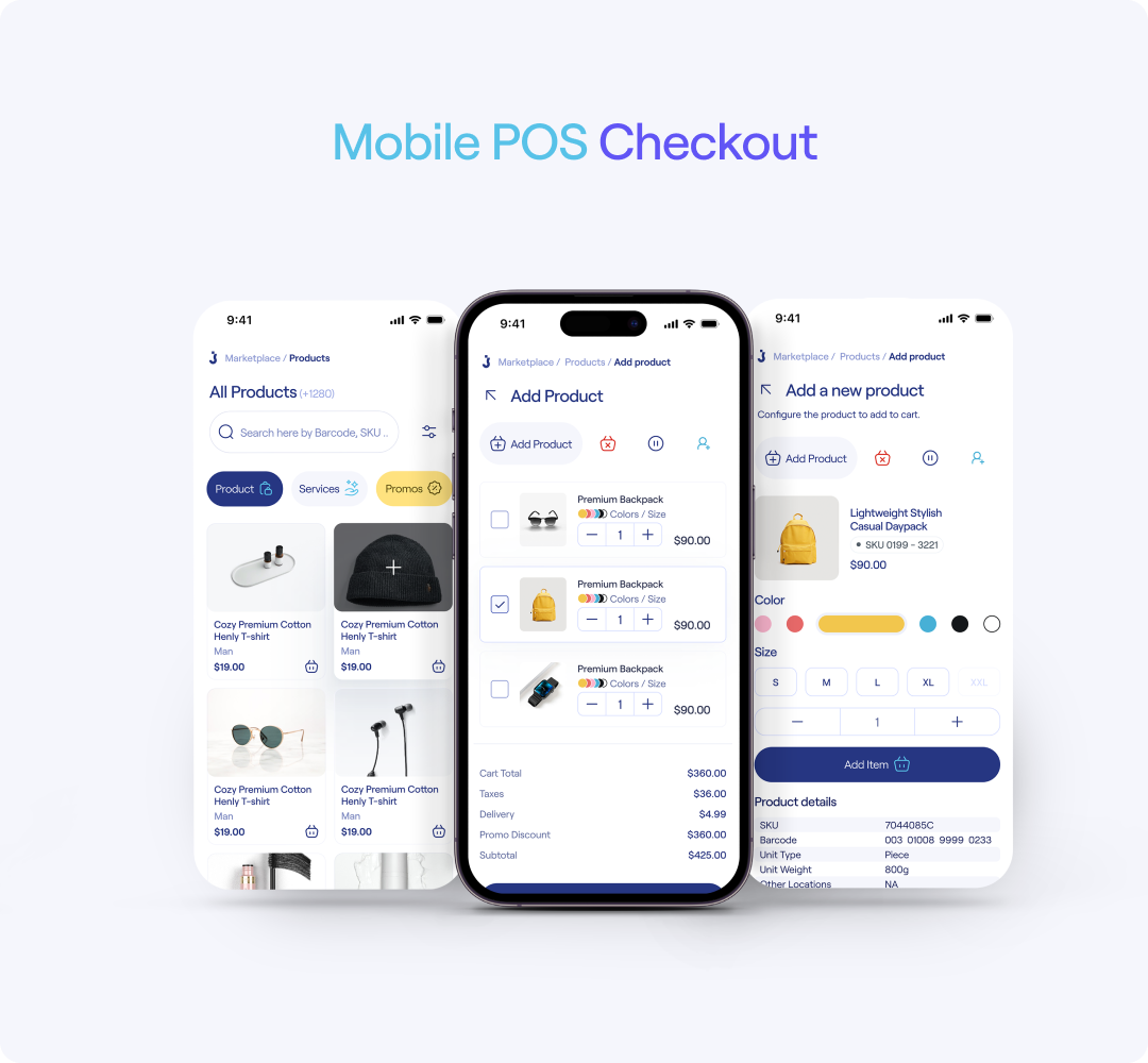
The POS had to work on iPad behind a counter, on mobile for market stalls, and on web for back-office processing — each with different user roles. The core challenge: one coherent experience across three fundamentally different form factors.


JOBR Design System · Foundations → Color, Type, Components
Every ramp and weight was picked to keep five sub-brands feeling like one company — accessible, consistent, and built to scale across web, iOS, and Android.
A single typeface — Roobert — carries the entire product across 13 sizes (10–72px) and 5 weights, Light through Bold. Headings and body text share the same family, differentiated by weight and scale rather than a second typeface, keeping every screen visually unified.
Every component below is built directly on the token layer — no one-off colors, no one-off radii. Every primitive, from buttons to inputs to cards, is fully rounded — a deliberate, consistent pill-and-circle language across the entire system. From primitives through composites, the library covers what five live sub-brands actually ship with. These are real, rendered with the system's tokens, not icons standing in for them.
| Order | Vertical | Status | Amount |
|---|---|---|---|
| #JB-3021 | Market | Live | $84.00 |
| #JB-3022 | Trade | Pending | $212.50 |
| #JB-3023 | Drive | Review | $19.00 |
User interviews with SMB owners, competitive analysis, and Jobs-to-be-Done mapping. Built a deep understanding of how small businesses actually operate before designing anything.
Information architecture and user flows for all six products. Mapped how users would move between products. Built the design token and component foundation before any UI work.
Iterative design process from low-fidelity wireframes through usability testing to pixel-perfect high-fidelity prototypes. Every edge case, empty state, and error message designed intentionally.
Detailed developer handoff specs in Figma, design QA sessions with engineering, and WCAG 2.1 AA accessibility review on every feature before ship.
Stakeholder interviews, competitive audit, user archetype definition, and business model mapping before any wireframe is drawn.
Information architecture, user journey maps, task flows, and screen inventory — documented in FigJam before moving into Figma frames.
Identify which existing tokens and components to reuse, which need extension, and which require net-new creation.
Unmoderated usability testing via Maze, Hotjar heatmaps post-launch, and Amplitude funnel analysis to track drop-offs.
Annotated Figma specs, Storybook component mapping, Zeroheight documentation, and design QA sign-off before release.
Every shipped screen has complete redline annotations: spacing values in tokens (not px), component names matching Storybook IDs, and state coverage for every interactive element.
A living design system site covering every component and color ramp with usage guidelines, contrast ratings, and do/don't examples. Engineers never have to guess intent.
Design components are mapped 1:1 to Storybook stories. Engineers verify visual implementation against the source-of-truth component before it reaches production.
Formal QA at three milestones: component build, integration, and pre-release. Each pass checks spacing fidelity, color token usage, and responsive breakpoints.
Amplitude funnels, Hotjar heatmaps, and Maze usability scores are reviewed at every sprint retro, directly informing which components need iteration.
Weekly design critique, bi-weekly design/engineering sync on implementation parity, and monthly system health reviews to deprecate stale components.
I initially framed the design system as infrastructure — necessary but separate from product work. That framing was wrong. The 8-step color ramps and the Roobert type scale weren't just visual cleanup; they were the single largest product decision JOBR made. They enabled five sub-brands to exist as one company.
Annotating contrast ratings directly on every color step — instead of running audits after launch — meant no vertical ever shipped an accessibility regression. The 5 minutes spent labeling "AA 5.8" on a swatch saved hours of post-launch fixes, every single time.
Designing one geometric motif — diamonds and rounded squares recomposed per vertical — meant every new sub-brand could get a distinct, ownable mark in days, not a multi-week brand exercise. Family resemblance was built into the system, not bolted on after.
Committing to Roobert alone — no secondary display face — forced every hierarchy decision to be made with weight and scale instead of typeface-switching as a crutch. The constraint produced a calmer, more confident product across all five verticals.